Your food bill is hiding in the average: where the real rises are
Food inflation sits at 1.3%, but pasta packets, juice and water are rising far faster. The fix is targeted, not blanket.
The 1.3% is doing a lot of work
Food and non-alcoholic drink inflation is 1.3% for the twelve months to August 2026. This single rate can make groceries look stable, but it blends very different movements together. The ONS tracks 135 everyday shop items, finding that 80 rose and 53 fell in price between January and August 2026. The median item is up only 0.9%, yet the spread between these groups is significant.
A single category rate smooths over different trolley experiences. If your basket is heavy on the rising items, your cost increase will feel different from someone’s who buys more of the falling items. The average hides these large differences between the specific items you actually buy.
These figures are research-grade segment indices, not every brand or pack size. The price spread in a given shop may be wider than these national figures suggest. Checking your own trolley against the specific segments is a reasonable way to see where your costs are moving, rather than relying on the headline number.
The outliers quietly in your trolley
The same food in a different format can move in price very differently, so the format you buy may matter as much as the ingredient itself. The data shows the price change for each format, not the reason for it, and availability and taste may limit which format you can realistically switch to. Consider pasta: packet or pot versions are up 24.1% between January and August 2026, while dry or fresh pasta and noodles are up only 2.7% over the same period. This is not an exotic item; it is a weekly staple.
Similarly, fruit juices from concentrate are up 14.5% and water is up 12.9%, whereas rice in all forms is up 4.5%. These specific increases suggest that the 1.3% headline may not reflect your own numbers if your trolley leans on convenience formats. The principle here is that the specific format of a common item drives the cost difference. You are not paying for a different ingredient, but for a different preparation method. Checking which specific versions of these staples you buy regularly is a more accurate way to understand your true grocery inflation than looking at the broad average alone.
Where prices are actually falling
Butter derived from milk is down 4.4% between January and August 2026, while chocolate with no additional filling has fallen by 9.4% over the same period. These declines are significant reductions in cost for specific staples. If your trolley is weighted toward these falling items, the overall bill can feel cheaper even while the headline average sits at that previously mentioned rate. The falls pull the aggregate number down just as much as the rises pull it up, creating a balanced effect that masks individual price movements.
This balancing act means the total looks flatter than it might otherwise. If your weekly shop is heavy on butter and chocolate, the rising items may be less noticeable because the total appears more stable. The data tracks these movements separately, showing that different products move in opposite directions. Understanding which items are dropping allows you to see how your specific mix of goods affects your actual spending, rather than relying on the single blended rate.
What to do at the shop
Start by pulling out your recent shop receipts and circling the items you buy every week. Check whether any of these sit in the rising segments, such as pasta packets, fruit juice, or water. For each rising item, look at the raw-ingredient or dry alternative and compare the price per serving rather than just the pack price. Recheck this list periodically, because the spread of risers and fallers shifts over time. Focusing on a few specific items that are rising quickly can change your total more than a blanket change across the whole trolley. This depends on how much of your basket those items make up, and a substitution only helps if it fits your diet, routine, and taste. A saving you never use is no saving at all. This is general information, not personal financial advice, and the ONS segments may not match every shop or brand you visit.
Worked example: what the pasta-packet rise adds to a line item
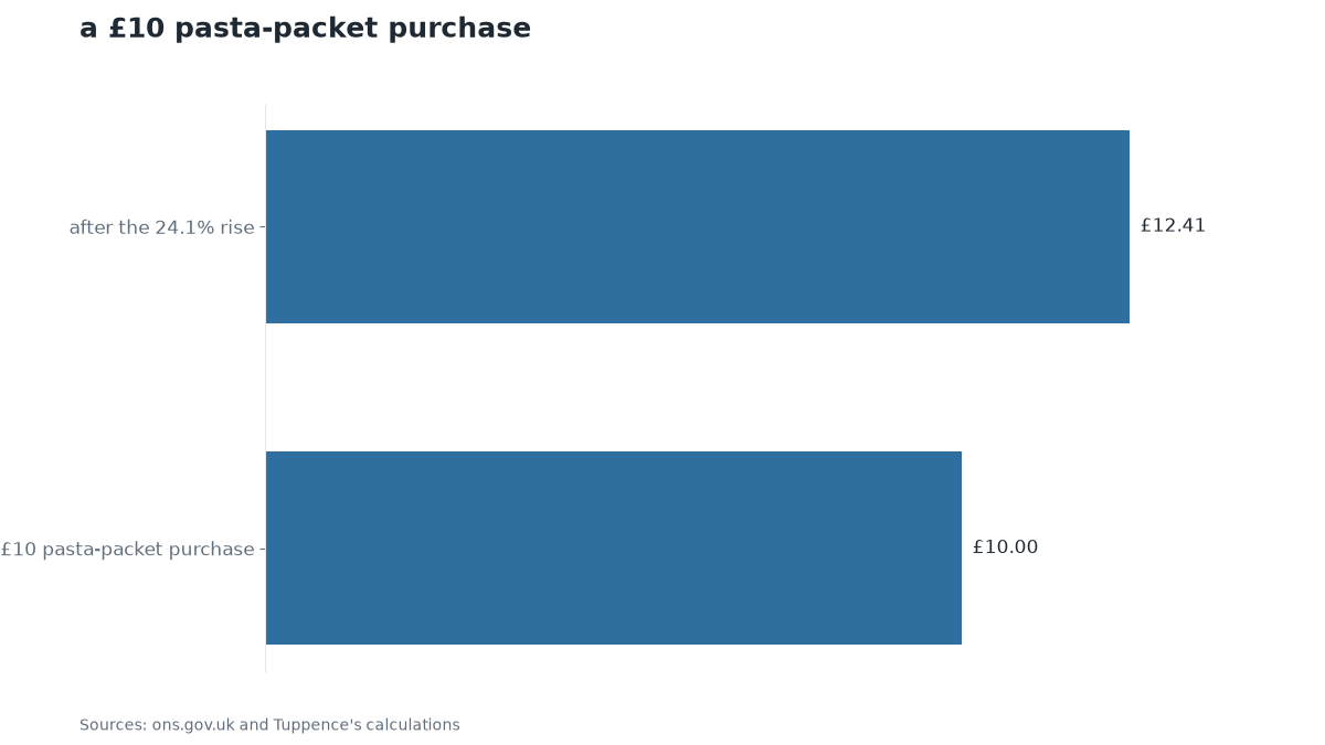
Let’s look at a single line item to see the difference. Assume you spend £10 on pasta packets in a typical week. With the 24.1% rise recorded for packet and pot versions, that same £10 purchase now costs £12.41. The difference is £2.41. This is the extra cost you face if you stick with the ready-made format.
Now consider the alternative. Dry or fresh pasta is up only 2.7% over the same period. If you switch to that format, the price movement is much smaller. The key point is not the total bill, but the size of the gap between the two formats. A £10 spend on one type of pasta can become £12.41, while a similar spend on dry pasta moves far less. This illustrates how the specific format you choose drives the cost change, independent of the broader average.
- Pull your recent shop receipts and circle the items you buy every single week
- Check whether any of those items sit in the rising segments: pasta packets, fruit juice from concentrate, or bottled water
- For each rising item, find the raw-ingredient or dry alternative on the same shelf and compare price per serving, not just pack size
- Recheck your trolley list periodically, because the spread of risers and fallers shifts as supply costs change
Sources
This digest was drafted by StreetOwl’s own model from published figures and the sources listed, then read and approved by Michael Rossi on 9 October 2026 before it went up. It is general information, not financial advice: your circumstances are yours, and for a decision that matters, MoneyHelper (free, government-backed) or a regulated adviser is the place to go. General information, not personal financial advice. Figures checked on the dates shown.
← Back to StreetOwl